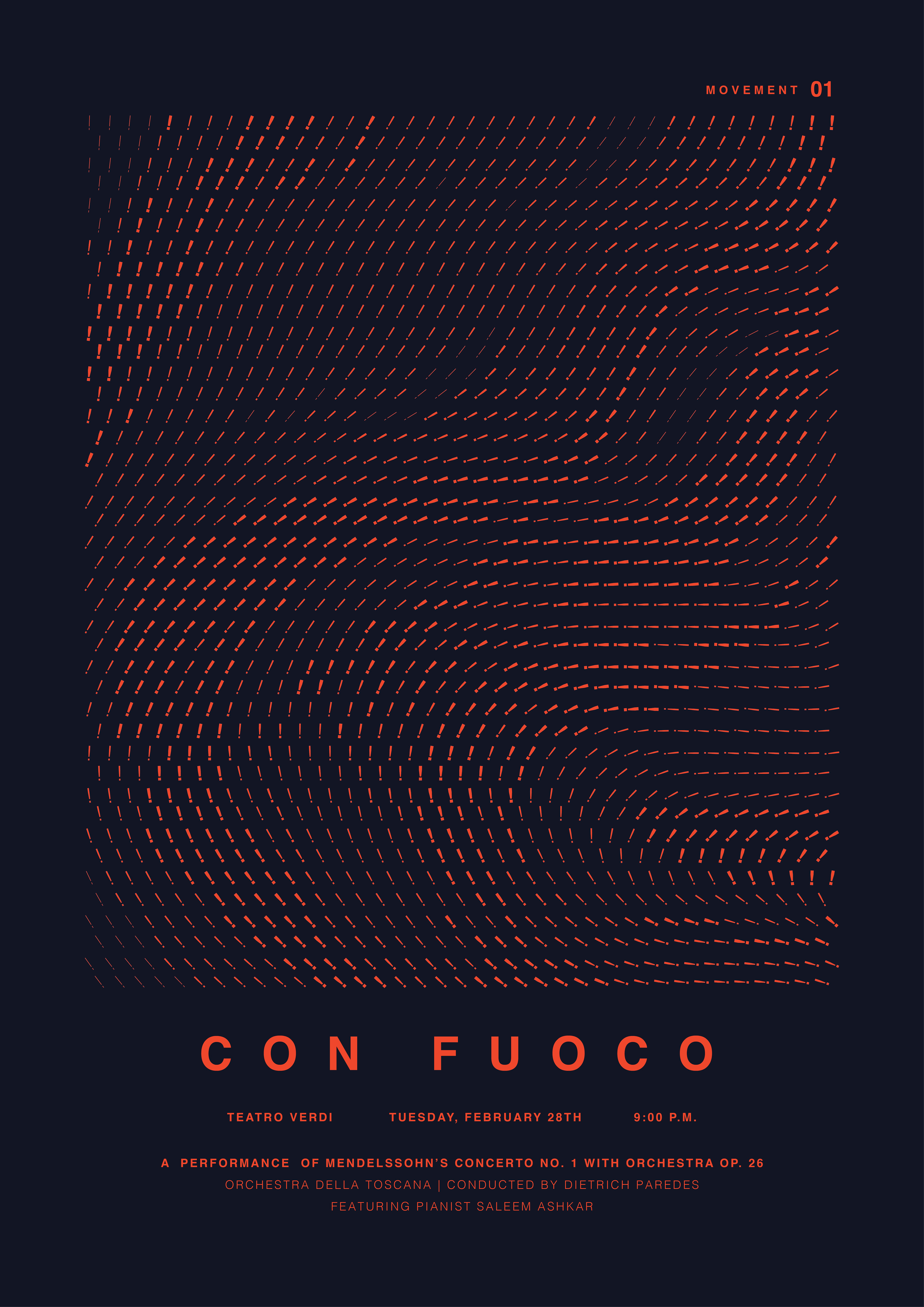

Con Fuoco
poster design | expressive typography | event signage
This event poster for a performance of Mendelssohn's Concerto No. 1 uses only typography to convey the rich complexities of the classical composition. I was particularly interested in the way the many individual staccato notes of the piano make up larger, more dramatic themes, and wanted to reflect that using the type. Each of the posters represents the mood of each movement, as does the individual punctuation marks used repeatedly to represent the piano notes - an exclamation mark for the motion meant to be played "with fire," a comma representing the "walking" pace of the second movement, and a caret representing the energy in the "fast and lively" final movement.